Tuesday 31 January 2012

Q4-New media in your R&P, production and evaluation?

We used many forms of new media when constructing, producing and also in the evaluating our products. This technology enabled us to display and present our stages and also edit and record our products. Without these technologies we wouldn't of been able to achieve the products that we did. (Click on the images to enlarge them.)

-Jack-
-Jack-
-Jack-
-Jack-
-Jodie-
-Jodie-
-Jodie-

Friday 27 January 2012

Goodwins Analysis of our Music Video

Intro & Genre 
The band that we made the video for are called FranKo and they are a pop rock band from south London and stereotypical videos of the pop rock genre would be of the band performing together also individually.  The editing would also be cut to the beat to carry the momentum of the music and it would also build up to the chorus sections. I think that our music video doesn't break these conventions as it is a performance based video and is also cut to the beat this should help us gain more of an audience because they will liken our video to already exiting ones of a similar genre. Our video also involves a story which is also commonly seen in the similar genre music videos such as the video to The Panic At The Disco song 'I Write Sins Not Tragedies' which contains a narrative along with the performance. I think that the narrative is a nice addition to our video because it adds more of a personality to the band and this will be appealing to the new target audience.   

Relationship between lyrics and visuals 
There is an obvious relationship between the lyrics and visuals in our video as the song title and the chorus emphasize the words night time and the videos performance and narrative is set in the woods in the night time which is a direct link. There are other more subtle connections between the lyrics and what you see on the screen such as the sense of hyper reality in the video and also in the lyrics because in the lyrics the band say such things as "when the ceiling hits the floor" and in the video the audience see the band being woken from there dead state and then performing as zombie like creatures which is on the same level of hyper reality as lyrics which shows an equal level of oddness. I think that there is enough of relationship between the visuals and lyrics that the you can tell the video is linked to the song but not to much that it seems like the video is following the songs every word.

Relationship between music and visuals
We have created a definite relationship between the music and what the audience sees on the screen. The way reason for this is in the editing process we cut the video to the beat. Using multi-clip editing we could cut the film along with listening to the track so this gave us a more accurate chance to cut to the beat and this helped give the video more movement. Especially when we could cut the video faster in the chorus sections to give it more emphasis and then also towards the end where the beat is the most prominent. The colours in the videos also represent the genre because darker colours normally represent a heavier sound of rock and this is quite a heavy song and I think that the dark colours say to the audience that they do make heavy music. This means that without even listening to the track the audience would be able to tell that is it rock music.

References to the notion of looking/eyes
There are several notions of looking in the video such as the band looking into the camera when they are performing and also the girl creature character looking into the camera whilst she is killing off the band members. This hints that the characters know that they are being filmed which is an example of post modernism because they know that they are in a music video. This is a way that the band can connect with the audience because by looking at the camera they are personalizing themselves with the audience. The eye contact is also a way of making the girl character seem more intimidating by looking at the audience she makes them feel uncomfortable and this makes the video seem more professional in the way that characters are presented.

Intertextual References
There no intertextual references in the video because we feared this would make the video seem less professional.

How we plan to present this... We plan to present this in the green screen presentation where me and Jodie talk infront of the video and pick out key parts. 
       

Combinations of our Ancillary Products

What we find effective for all three of our ancillary products are that they all have a dark personality which keeps the music video in tone with the website and digipak, as they all share the same font, logo and style of photos. Some photos appearing on the website have included the background imagery from the digipak to combine with the website. The members of the band also appear on all 3 products in the same style of clothing without putting the lead singer in the spotlight. This gives each member the equal amount of publicity for the fans as they may prefer one to another. Another element which is effective is that whilst creating our ancillary products, we were gaining influence off other major bands and also our chosen band FranKo. We kept their style from their website of being one home page full of the main features and styled our website on Wix similarly but spaced out instead of appearing crammed onto one page..........

Thursday 26 January 2012

Final Feedback Questions

When getting our final feedback we decided that we would get several different focus groups in and record them answering different questions about what they like about the video and also what they think could be improved and what image they got of the band from video and the other products. These are questions that we will get members of the focus group to answer after they have viewed the video:

Friday 20 January 2012

Final Website

This the final published webpage that we created for our band FranKo.

www.wix.com/jckthornton7/frankomusic

Target Audience Profile

When looking at similar bands we chose to look at All Time Low an american, pop punk band who share the same target audience as our band, Franko.
We started off looking at their MySpace page, a website used by all mainstream, current and unsigned artists to promote themselves to the public.
They have a very large group of fans following them on Myspace

Updating their current location and keeping their fans up to date with the schedule for their performances 

include a USA and UK store showing they market in both countries.
Tour Dates are set out clearly showing which shows are still available and which are sold out

bio about each member

streaming their current single and video to promote and advertise.

also streams a chosen playlist with all big hits from the band.

Then we went on to look at their twitter page which didn't include as much about the band but allows the members/crew to update their followers on the latest information about tour dates, singles & albums release dates etc. Since twitter is becoming one of the two most popular social networking sites, fans have so many ways to access their page, for example twitter can be installed onto mobile phones so fans can check in with the band to see the latest information.

Again All Time Low have many fans following them on twitter

adding a link in their bio to their official website would direct  followers to  their merchandise, tickets for tours, promos and advertisements reeling in potential customers 

Another nationally used social network is Facebook where millions of users pass on information to their friends who pass it on to their friends and so on, so its no wonder All Time Low again have this many followers on facebook which again can be used to inform fans when upcoming shows are, where they're going to tour and generally what the band are doing themselves.
Much alike their Myspace page, All Time Low have a streamed playlist available on their facebook page.

Wednesday 18 January 2012

Digipak Final


Remaking of our Digipak

We had both worked together on this and thought maybe a screen recording would be the easiest way to present our skills on Adobe Photoshop.
Editing done by Jodie. (50ish minutes of recording fit into 2:54)


Digipak Feedback

After asking a group of teenagers what they thought of our digipak, these are the responses we had received.


  • That we needed to redo the spine for the inside of our digipak
  • Spaces between the names were essential as some couldn't read their names
  • They were very fond of our production company logo and that it suited our type of band
  • That we had included all of our band and not just singled anybody out or had gotten a different person in to pose
  • The FranKo logo stood out well against the design of the digipak
  • The fact the theme was in black, white and grey suggested a rock genre to them
  • They approved of the instrument image on the inside of the case
  • They thought maybe we could add a subtle amount of colour just to make it stand out.
  • The front cover reminded them alot of the 'Kings of Leon' cover
  • the them suggested a playful and relatable approach

After considering all of our feedback we had looked back at some of our evaluation questions and had decided that maybe it was best we came up with another digipak design. We had already prepared for a few other designs and thought that since the digipak was the ancillary product which stood out from the flowing theme, we should create one which would maybe fit in better.

Group Meeting 18/01/12

Summarising the beginning of January:

After looking at all the feedback on our music video, we then asked for some feedback on our ancillary products, mainly our Digipak. What we got back was mostly positive and a few points were raised about the recurring theme of our our products combined. The people we had asked (ages ranging from 16-18) said that the music video and website were both very in touch with each other however the digipak needed to be tewaked in order to fit in.

This was something we had discussed recently after re-editing our website and we've been thinking of changing the design of our digipak and darken out the colour scheme and keep away from becoming too much alike 'King of Leons' album 'Only By The Night's front cover. We have been discussing new ideas ever since and come up with a few initial thoughts.

We have also been busy preparing for our Evaluation Presentation for all 3 ancillary products, we have both made separate notes over our time away from the academy and we are now currently putting together our presentation.

Thursday 12 January 2012

Construction of the Website Pt.2

When we had completed the first draft of our webpage. We then got feedback from the target audience from around the local area and they all said that our webpage lacked a main banner or image that introduced the whole band and also there title. So Jodie created a banner design that would cover the top of the webpage.

As you can see this banner design is affective because it has images of the band members and also the band name. This gives the audience a chance to look at the whole band when they first load up the site. I made the link buttons big this makes them stand out more so that the audience will have a greater chance of seeing them and using them.
We also made the button design 3D because we thought this looked more professional.

 We also had the idea of adding in links to the band members individual social networking accounts. This gives the audience a chance to see what they are like personally and will attract more of an audience.

This the connect box that we designed for the website. This is designed so that the target audience can follow the individual band members and personalise with them. We already had the photos from the shoot that we did but Jodie put the images together and gave them to me. This is where I uploaded them and gave them different coloured Twitter icons, I gave them different colour ones so that they seemed more individual.   

This is the construction of the connections item. (Creating the links.) 

Friday 6 January 2012

Final Cut: FranKo - Night Time

Changes Made Due to Feedback

Since looking at our constructive feedback, we have been making adjustments to our video according to what our target audience have written. Since have a limited time and budget, we haven't been able to re-shoot any footage to add to our narrative. This means that we have had to re edit our existing footage to improve the storyline.

We started off by adjusting the colour correction to make the transitions between shots run smoother. We did this by adjusting the filter ratios on the individual clips.

We also received some feedback about the tempo of which the shots were cut to, which made the video appear "disjointed" from the song. So to fix this issue, we reused the clip made for multiclip and adjusted it to the tempo and made sure the clips fit the beat.

The new multi-clip section that we added.  
Other comments made, included points about the band not being "zombified" at the end enough. There is no way for us to over exaggerate the fact they are undead beings, however we have added an overlay to a selection of the shots to change the colour correction to change it slightly over exposed.

A few more comments were people saying about how there needed to be a few more shots of the band together and how the femme fatal character does not appear in the majority of the video. This is mixed views as some think it adds to the suspense, whereas others do not agree and think it makes the narrative appear a bit vague and unclear.

This the record company title we added at the end. 

Thursday 5 January 2012

Received Feedback

This is the feedback that we received from posting our video on social networking sites. We have taken this feedback in to account and will tweak our video considering all our comments. These are the screenshots with the feedback we received:


Tuesday 3 January 2012

Evaluation Question 4 - notes


Final Cut - This is the program which we used to edit and add effect to our music video

Adobe Photoshop - The program where we were able to edit our digipak design, our banner for the website,  The introduction banner and much more. Music industries use this program to get the best quality in their images

Adobe Illustrator - The program we used to create our production image.

Social Networks - Twitter, Facebook and myspace were all site we had used to research and get feedback for our band and their video. Creating pages and groups for them to boost their popularity

Youtube - The most well known video sharing website which we used to upload all videos leading up to our final video and including that as well.

Cameras - We had used a Sony HD to film the footage for our video and a Nikon D90 to take photos of all of our shoots. Both these cameras are used in the industry.

Wix - We used this site to create our website and found it very easy to use with only minor problems at the start which we managed to overcome and produce a website fitting in with all of our ancillary products.


Evaluation Question 2 - notes

Effective

  • We have kept the same tone of all 3 products
  • The font and logos have all remained the same on each product
  • Each band member has made an appearance instead of singling the lead singer out
  • The website and video share the same type of theme
Non Effective
  • The digipak could be related more towards the design of the video and website.
  • There aren't many images of the band together on the website - could be improved

Evaluation Question 1 - notes


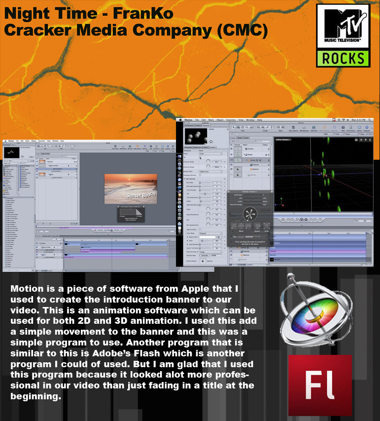
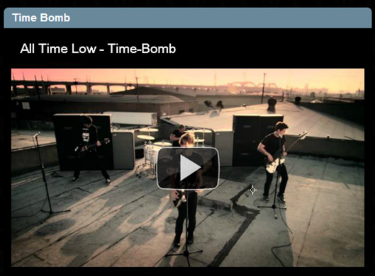
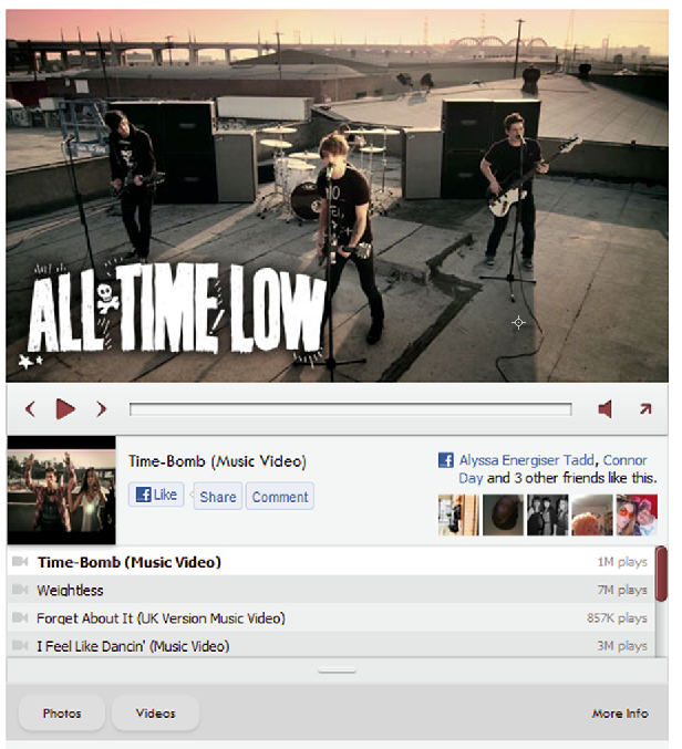
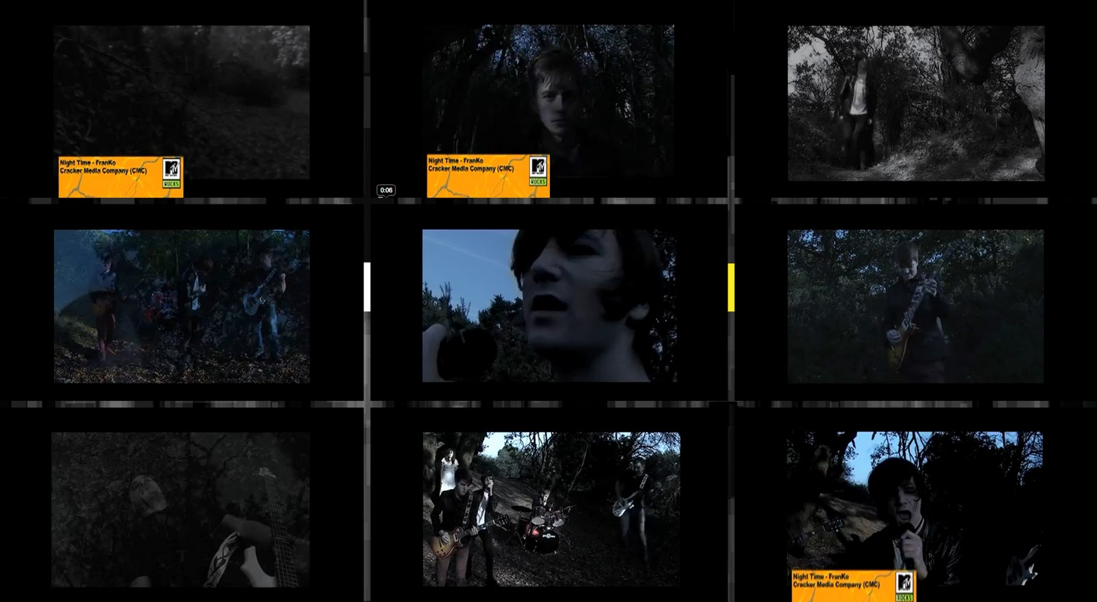
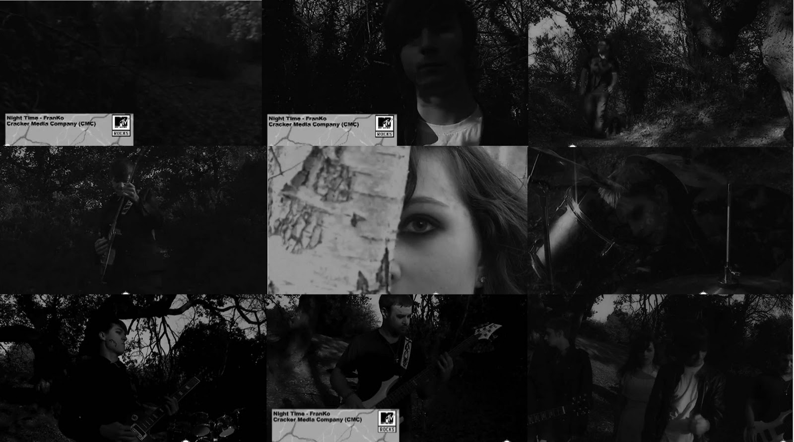
Screenshot 1- The intro banner introduces the band, the name of the song and the channel this type of music video can be found on.

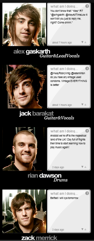
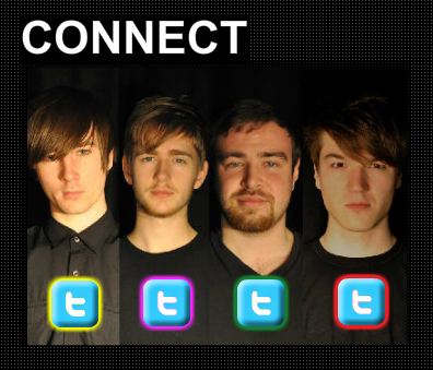
Screenshot 2 - Intro of each band member so the audience can see for themselves that its the band in the video and not some other actors.

Screenshot 3 - The use of black and white/bad film creates an old story effect over the shot. This is used in a lot of videos to create the illusion of a story being told without words.

Screenshot 4 - Cross dissolve is used in a lot of videos, it adds effect to the fade in the beat and adds emphasis to the change in tempo and beginning of the next shot.

Screenshot 5 - Close up shots are used in nearly every music video. Close up shots of the singer lip syncing  are used in every performance based video and it relates to the viewers.

Screenshot 6 - Guitar solo broken down into two different shots adds definition to the solo especially as it changes from narrative to performance. Guitar solo = his struggle against femme fatal.

Screenshot 7 - Overlay of other shots is used in lots of modern day music videos. Pixie Lott recently used it in the beginning of her video 'All About Tonight'.

Screenshot 8 - A master shot of the whole band shows them in their zombie selves and reveals the enigma from narrative.

Screenshot 9 - The banner reappears as the video ends, letting the viewers know the video is over and lets people who missed the intro know who the band are, and their song to search the video and band online.

Monday 2 January 2012

Evaluation Question 4- Notes

Blogger- We used this site to write and show evidence about making all our products and also about all the group meetings we had. This has been a very useful tool.

Final Cut Pro- This is the editing software that we used to create our video and put it all together. This is a tricky software to use but over the time of editing our video we learnt how to use it properly.

Adobe Photoshop- This is the software that we used to create our album cover and all of the graphics for the website and video. We already knew how to use this software so this was very useful when it came to creating graphics.

Motion- This the program that we I to animate our banner for our music. I had no previous experience with this software and had never used it before but by working it out I managed to create a simple animation that could be exported to Final Cut Pro.

YouTube- This was a very useful site for receiving feedback on our video as it allows us upload and share the video among millions of different users across the world. From here we could share the link on other social networking sites.

Reddit- This a user generated organisation site and we one of the sites we used to gain feedback from.

Facebook- This is a social networking site that we created a FranKo page for used to get feedback on our video. This was the most successful form of getting feedback.

Twitter- This is another social networking site that we used to gain feedback from.

Camera- We had a Sony camera that shots in HD and we all the music video on this. This was a very reliable camera that did not break during the shot.


Evaluation Question 2- Notes

How effective is the combination of your main product and ancillary products? 

Effective 
  • The fonts and the logo run across all 3 products we created. 
  • They are all connected across one of the products. (The website has images and tracks off the album and it also has the video embedded so that the audience can view it from the webpage.) 
  • The band members faces are on all products and really promotes them as role models and icons. 
  • The music video and website run along the same colour themes both using dark colours. This makes it look more professional and makes it flow.   

Not Effective 
  • Something that is not effective is that the album doesn't follow along the same colour scheme as the other two products and this makes it look a bit out of sync. This is something that could be improved. 
  • There aren't a lot of photos of the band playing there instruments, this could lead to the audience being confused as to who does what.  

Evaluation Question 1- Notes


Screenshot 1.

  • As you can see the title banner pops up at the start of the song which displays the title of the song and the artist. It also contains the MTV Rocks logo and this hints at our target audience because when they see the logo they will want to listen to the song and watch the video. 
  • At the beginning of the video you don't see anyone and this adds enigma and makes the audience wonder what the band look like.    
Screenshot 2. 
  • In the second screenshot you can see that we have started introducing members of the band by showing them in a mid close up shot. This lets the audience see and remember there faces. 
Screenshot 3. 
  • This one of the narrative parts of the video as you can see because the band member isn't carrying an instrument. 
  • He is also alone in this shot which signifies that he is going to be taken. This shot has also got a filter over it which makes the shot look different and we have put this filter over all the narrative parts so that they are recognisable. 
Screenshot 4. 
  • This the guitar solo shot and we flick between two types of shots that are the same the in different environments and this makes it seem like the background is moving and not him. I haven't seen this in any music video and think this is a unique feature of our video. 
Screenshot 5. 
  • The shot in screenshot is one that we use several times throughout the video. This is a powerful shot because it shows the true terror of the femme fetal character and also how there is some light behind her character because this is the brightest shot in the whole video. 
Screenshot 6. 
  • This screenshot happens during the breakdown piece of the music which means that we had to slow down the pace of the video and we did this with overlaying moving images over eachother. This gives the video a dizzy effect and we thought this suited the song. Many other videos did inspire us to use this technique like Adele's video for Chasing Pavements.   
Screenshot 7. 
  •  This a screenshot is from the last chorus and as you can see all the characters have changed and this is obvious because of there make up and the way the shots have been darkened even more so that the audience can tell they are getting more evil.  
Screenshot 8. 
  • As you can see the banner appears at the end of the video to just like it would on a television program. This makes the video seem more professional and will attract the target audience more towards watching the video and getting hooked by the song. 
Screenshot 9. 
  • This is the shot that ends the video and as you see all the characters are in the same frame and this allows the audience to see all the band together. It also eliminates all the mystery that is built at the beginning.